Advanced on page SEO made simple.
Powered by POP Rank Engine™
Includes AI Writer
7-day refund guarantee
As a digital marketer, you are probably aware of the importance of CTAs, or calls-to-action. These are buttons or links that entice users to take a certain action, such as making a purchase or subscribing to a newsletter. CTAs play a crucial role in driving user conversion, so it's essential to optimize them for better results. There are several factors that can affect the performance of CTAs, including design, placement, and language. To get an in-depth SEO analysis and specific recommendations for optimizing your content, you might consider using tools like PageOptimizer Pro. In this blog post, we will be discussing how to optimize CTAs for better user conversion and SEO.
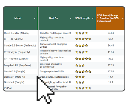
Which is the best LLM for SEO content?
Get the full rankings & analysis from our study of the 10 best LLM for SEO Content Writing in 2026 FREE!

- Get the complete Gsheet report from our study
- Includes ChatGPT, Gemini, DeepSeek, Claude, Perplexity, Llama & more
- Includes ratings for all on-page SEO factors
- See how the LLM you use stacks up
Understanding the Role of CTAs in Content Marketing
In content marketing, CTAs play an integral role in customer generation, attracting leads, and inviting website visitors to engage with your content. You may have noticed CTAs peppered around various marketing channels, but can't fully comprehend their significance without a deep dive. So let's take a moment to appreciate how CTAs convert passive readers into potential customers in the context of content marketing.
CTAs, or Calls-to-Action if you're not familiar with marketing jargon, are essentially 'signs' directing visitors to your business's desired action, such as subscribing, requesting information, or making a purchase. They're particularly vital for steering website traffic and bolstering the effectiveness of your marketing strategy. If you're keen to see an increase in user conversions, it's critical to optimize CTAs. Having an optimized CTA could help your business navigate customer generation, urging online visitors to take an intended action. By skillfully incorporating CTas in your marketing content, you can provide your audience with clear directions and potentially increase your conversion rates exponentially. Remember, when it comes to CTAs in marketing, they're not just there to fill the space on your page – they’re there to convert leads, and optimized CTAs make this task much more manageable.
Optimization Techniques for Effective CTAs
1. Understanding Your Audience
Before you can start creating CTAs, it is essential to understand your target audience. You need to know who they are, what they want, and how they behave online. By understanding their needs and behaviors, you can create a more effective CTA that resonates with them. For instance, if your target audience is mostly millennials, you may want to use more casual language and design elements that appeal to their style.
2. Use Action-Oriented Language
The language you use in your CTA is critical. It must be action-oriented and compelling enough to make the user want to take the desired action. Use clear, concise, and straightforward language that explains what the user will get by clicking on the CTA. For instance, instead of using the generic CTA "click here," you can use "get started" or "claim your free trial." These phrases convey a sense of value and urgency, which can increase user conversion.
3. Design Elements
The design of your CTA plays a crucial role in user conversion. The button must be prominent, well-positioned, and visually appealing. Use contrasting colors that stand out from the rest of the page design. The button text must be readable and in a legible font size. Additionally, you can add design elements that draw the user's attention, such as animation, arrows, or icons.
4. Placement
The placement of your CTA is another critical factor. It must be in a location that is easily visible and accessible. It must be placed above the fold, where the user can see it without scrolling. However, avoid placing the CTA too high or too low on the page. A CTA placed too high may not be visible on smaller screens, while a CTA placed too low may be missed by users who do not scroll down the page.
5. A/B Testing
Finally, A/B testing is essential to optimize your CTAs. Test different versions of your CTA to see which one performs better. You can test variations in language, design, placement, and more. Analyze the results to determine which version converts the most users. Once you find the version that works best, use it as your new baseline and continue testing new variations to improve performance further.
Finding the Perfect Balance: CTA Button Optimization for Action
Finding the perfect balance for CTA button optimization isn't child's play; it's a strategic move aimed at increasing user conversions. The use of CTAs in content marketing points users to take action, hence the repeated emphasis on action. However, optimization isn't about action alone; it's a blend of essential elements including cta buttons, button text, and even subtle cues like "cancel add" and "add save", to provoke user response. Considering character limits is significant while optimizing, so ensure your CTAs don't exceed the ideal characters min.
When it comes to optimizing, implementing various optimization techniques can enhance the efficiency of CTAs. Buttons add a visual cue to CTAs, guiding visitors to add more to their interaction with your site. Optimized CTA can remarkably boost conversion rates, but you've to invest time in understanding how to optimize ctas effectively so they convert efficiently. You must note that not all CTA button strategies would fit perfectly into your optimization plan, thus, finding the perfect balance in CTA add and other elements is crucial. You've to adopt an approach that suits your specific needs aiming toward an optimized user experience.
SEO Practices to Amplify CTA Performance: Optimizing for User Action
SEO is a powerful tool in driving visitors to your page. Numerous techniques can help optimize your CTA for better conversions, a crucial aspect of your overall SEO strategy. Unlike other aspects, a lot falls on the landing page. Here, visitors should make a decisive call for action. Creating impactful, persuasive CTAs requires you to make use of the right words. Remember, including these elements can indeed skyrocket your conversion rates. If required, include a direct link on the page, leading the visitors to a specific action point - a fundamental aspect of optimizing for user conversions.
Visitors are more likely to engage if the CTA button on your landing page is optimized correctly. That's where SEO practices come in handy - guiding you to make the changes that truly matter. Making use of targeted keywords allows your web page to perform better, ultimately leading to more conversions. Revisiting your CTA periodically, making necessary changes in content, layout, design, etc., can make a notable difference in your visitor conversion rates.
Mastering the art of SEO, landing page, and CTA optimization isn't easy but reaps significant benefits in terms of improved user conversions. And when users make the call, you know your efforts have paid off.
Which is the best LLM for SEO content?
Get the full rankings & analysis from our study of the 10 best LLM for SEO Content Writing in 2026 FREE!

- Get the complete Gsheet report from our study
- Includes ChatGPT, Gemini, DeepSeek, Claude, Perplexity, Llama & more
- Includes ratings for all on-page SEO factors
- See how the LLM you use stacks up
Start Improving Your CTAs
CTAs are a crucial element in your online marketing strategy. By optimizing your CTAs for better user conversion, you can increase the effectiveness of your campaigns and improve your website's SEO. To optimize your CTAs, you need to understand your target audience, use action-oriented language, design your CTAs effectively, place them in the right location, and test different versions to determine which one performs best. With these tips, you can create CTAs that convert users into customers and improve your online marketing performance.

(1).webp)


ll-1.webp)
