

Advanced on page SEO made simple.
Powered by POP Rank Engine™
Includes AI Writer
7-day refund guarantee
In today's digital landscape, the battle between mobile SEO vs desktop SEO has reached a critical juncture. With Google reporting that a staggering 70% of internet time is now spent on mobile devices, it's clear that the mobile revolution is not just approaching—it's here. This seismic shift has prompted Google to implement mobile-first indexing, fundamentally altering the SEO playing field and forcing marketers to rethink their strategies.
But what does this paradigm shift mean for your digital strategy? As we dive into the nuances of mobile SEO vs desktop SEO, we'll uncover how this change impacts modern SEO tactics and why a mobile-first approach is no longer optional—it's imperative. Understanding these differences is crucial for businesses aiming to maintain visibility and relevance in an increasingly mobile-dominated world.
Which is the best LLM for SEO content?
Get the full rankings & analysis from our study of the 10 best LLM for SEO Content Writing in 2026 FREE!
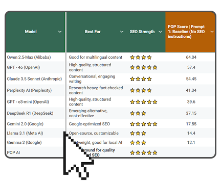
- Get the complete Gsheet report from our study
- Includes ChatGPT, Gemini, DeepSeek, Claude, Perplexity, Llama & more
- Includes ratings for all on-page SEO factors
- See how the LLM you use stacks up
Fundamental Divergences in Search Architecture
When it comes to mobile SEO vs desktop SEO, the core algorithms powering search results have distinct priorities that reflect the different contexts in which these devices are used:
- Mobile: Emphasizes location-based signals, recognizing that mobile users often seek immediate, localized information. This prioritization means that businesses with strong local SEO strategies may see better performance in mobile search results.
- Desktop: Tends to favor content depth, assuming users have more time for in-depth research. This preference often results in longer, more comprehensive content ranking higher in desktop searches.
This divergence extends to indexing priorities and crawl budget allocation. With mobile-first indexing, mobile pages now take precedence in Google's indexing queue, while desktop versions might receive less frequent crawls. This shift means that websites with poor mobile optimization may see a decline in overall search performance, even for desktop searches.
Understanding these differences is crucial for balancing your mobile SEO vs desktop SEO strategy. It's not just about having a responsive design; it's about tailoring your content and technical SEO approach to cater to the unique aspects of each platform.
Technical Implementation Differences
The technical aspects of mobile SEO vs desktop SEO require tailored approaches to ensure optimal performance across devices:

Page speed is critical for mobile, where AMP (Accelerated Mobile Pages) can significantly boost performance. Mobile users are often on-the-go and using cellular data, making fast-loading pages crucial for engagement. Desktop users, with typically faster connections, can handle richer media experiences without significant performance issues.
For structured data, mobile prioritizes app-related markup to enhance visibility in app stores and mobile search. This focus can lead to increased app installations and better integration with mobile-specific features. Desktop SEO benefits more from comprehensive schemas like FAQs and How-tos, which can lead to rich snippets and enhanced SERP features.
Navigation design diverges sharply between mobile SEO vs desktop SEO. Mobile requires thumb-friendly call-to-action buttons and simplified menus to accommodate smaller screens and touch interfaces. Desktop can accommodate more complex, multi-level menu structures, allowing for more comprehensive site exploration.
Content density also differs significantly. Mobile users prefer scannable, bite-sized information that can be quickly consumed on smaller screens. Desktop users are more likely to engage with in-depth, long-form content, spending more time on a single page.
Which is the best LLM for SEO content?
Get the full rankings & analysis from our study of the 10 best LLM for SEO Content Writing in 2026 FREE!
- Get the complete Gsheet report from our study
- Includes ChatGPT, Gemini, DeepSeek, Claude, Perplexity, Llama & more
- Includes ratings for all on-page SEO factors
- See how the LLM you use stacks up
SERP Feature Variations by Device
The battle of mobile SEO vs desktop SEO extends to how search engine results pages (SERPs) display information, with each platform offering unique features:
Mobile-exclusive elements:
- App packs: Showcasing relevant mobile applications directly in search results, increasing visibility for app-based businesses.
- AR preview integrations: Allowing users to visualize products in real-world settings, enhancing the shopping experience.
- Instant answer carousels: Providing quick, swipeable information for immediate answers to user queries.
Desktop advantages:
- Sidebar knowledge panels: Offering comprehensive information without leaving the SERP, ideal for brand and entity searches.
- Multi-column layouts: Utilizing wider screens for more diverse result types, allowing users to compare information more easily.
- Extended sitelinks: Providing deeper site navigation directly from search results, improving user experience and site exploration.
These SERP variations highlight the importance of device-specific optimization in your mobile SEO vs desktop SEO strategy. Tailoring your content and markup to take advantage of these platform-specific features can significantly improve your visibility and user engagement.
User Behavior Patterns
Understanding user behavior is crucial when comparing mobile SEO vs desktop SEO, as it informs content strategy and optimization efforts:
- Mobile: 72% of users engage in voice search (Quattr data), emphasizing the need for natural language optimization and featured snippet targeting.
- Desktop: 68% of queries are more complex and research-oriented, suggesting a need for comprehensive, in-depth content.
Click-through rates (CTR) also vary significantly between platforms:
- Mobile:
- Position 1: 24% CTR
- Position 5: 9% CTR
- Desktop:
- Position 1: 31% CTR
- Position 5: 4% CTR
These patterns underscore the need for tailored strategies in mobile SEO vs desktop SEO. For mobile, focusing on voice optimization and securing top positions is crucial due to the steep drop-off in CTR. For desktop, creating comprehensive content that satisfies user intent can help capture clicks even for lower positions.
Cross-Device Optimization Checklist
To excel in both mobile SEO vs desktop SEO, consider this comprehensive optimization checklist:
- Responsive design audit: Ensure your site adapts seamlessly across devices, providing a consistent user experience regardless of screen size.
- Dynamic serving configuration: Deliver device-specific HTML from the same URL, allowing for tailored experiences without the complexity of separate mobile sites.
- Device-specific schema: Implement structured data tailored to mobile and desktop experiences, enhancing SERP features and improving click-through rates.
- Core Web Vitals thresholds:
- Mobile: Aim for First Contentful Paint (FCP) < 1.5s
- Desktop: Target FCP < 2.1s
- Content parity: Ensure that mobile and desktop versions of your site offer the same content, preventing issues with mobile-first indexing.
- Mobile-friendly testing: Regularly use Google's Mobile-Friendly Test tool to identify and fix mobile usability issues.
- Local SEO optimization: Enhance your Google My Business profile and local citations, particularly important for mobile searches.
By addressing these points, you'll create a robust foundation for success in both mobile SEO vs desktop SEO, ensuring your site performs well across all devices.
Conclusion
In conclusion, the distinction between mobile SEO vs desktop SEO is more critical than ever. The mobile-first approach has reshaped the digital landscape, forcing businesses to adapt or risk falling behind. By understanding the unique aspects of each platform, implementing device-specific optimizations, and preparing for emerging technologies, you can create a comprehensive SEO strategy that succeeds across all platforms.


Kyle Roof is a Co-Founder & Lead SEO at POP, SEO expert, speaker and trainer. Kyle currently resides in Chiang Mai, Thailand with his family.


